01 / The challenge
The identity had to inherit AFC Commercial Bank’s credibility without simply becoming another expression of the parent brand. The answer was already present in AFC’s visual heritage: its greens, leaf motif and long-standing relationship with customers across Zimbabwe.
02 / The response
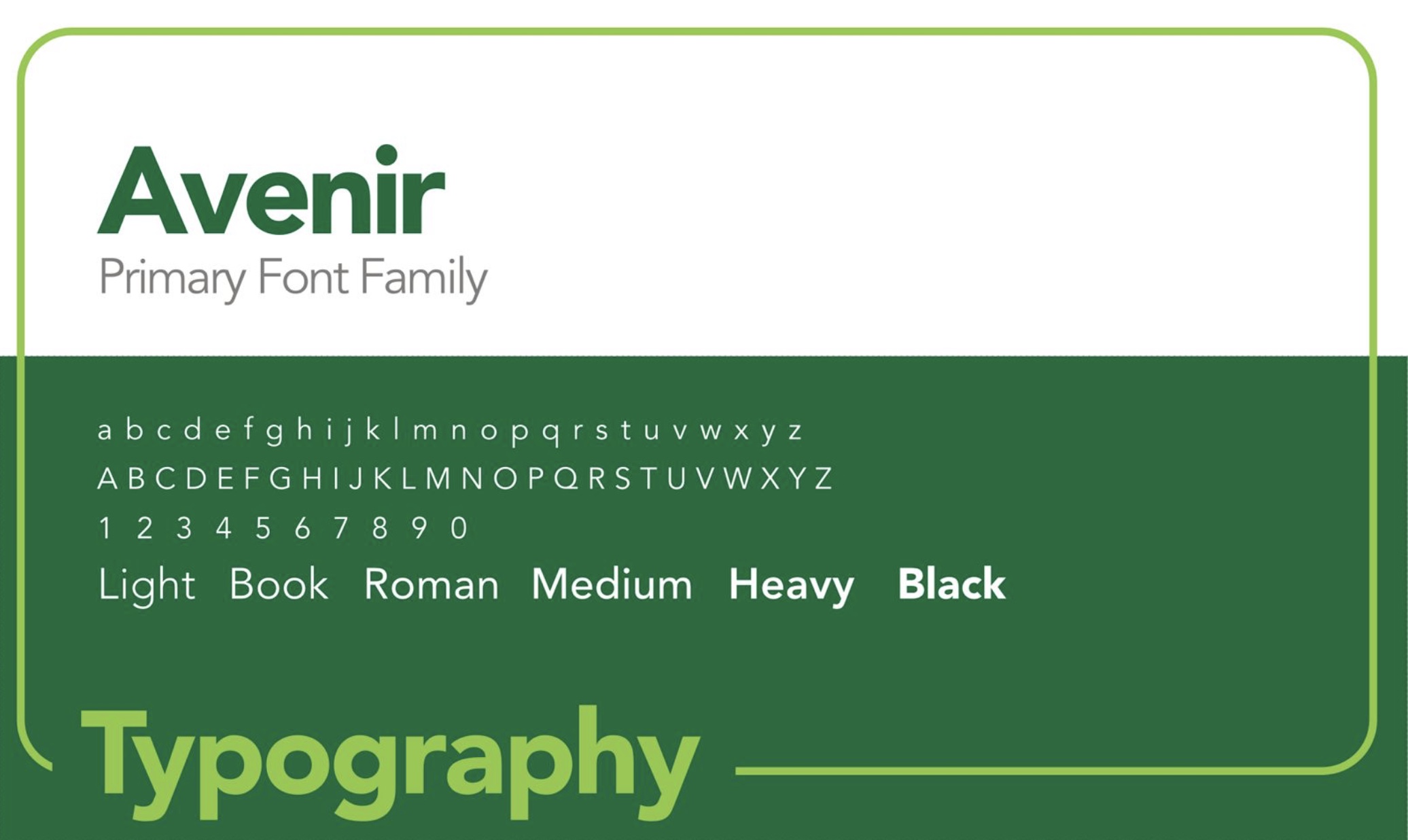
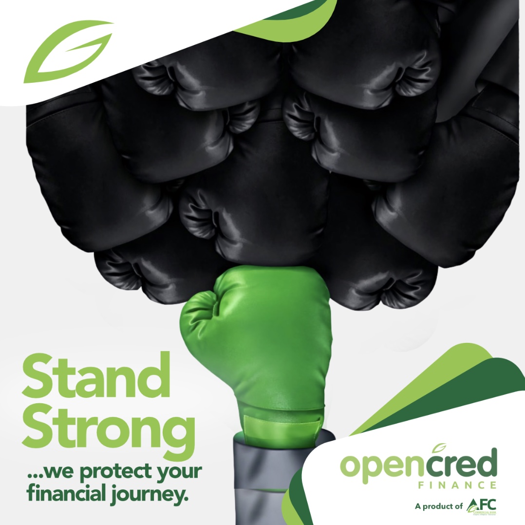
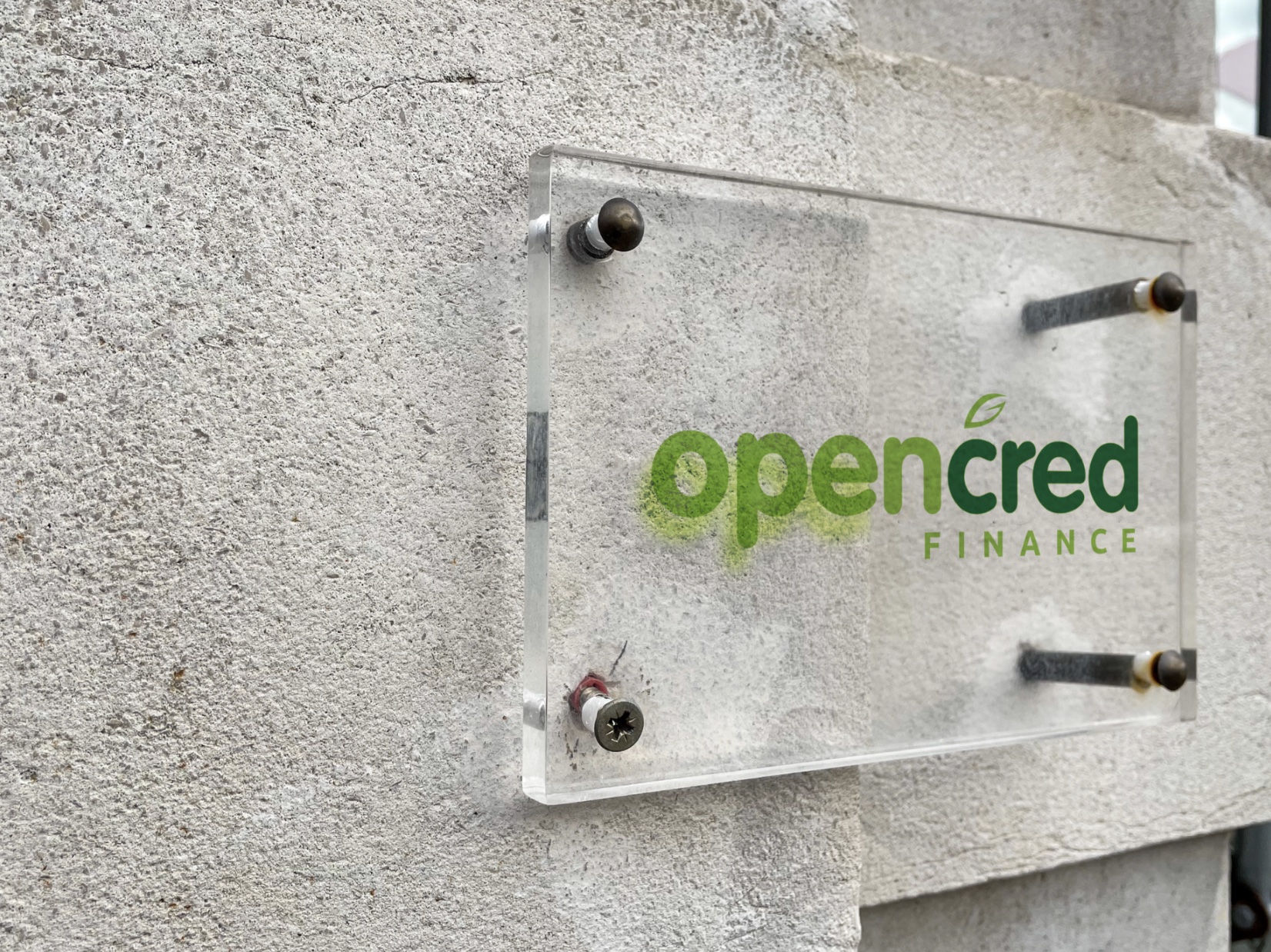
I used the palette and leaf as familiar anchors, then gave OpenCred a more modern, approachable voice. The two-tone wordmark creates a clear visual break between OPEN and CRED, balancing accessibility with financial credibility.
03 / What I learned
Good visual communication is not only about how something looks, but how it sounds. This project made me ask what a brand’s voice is saying, why people should trust it and how every detail can repeat that message consistently.